This article summarizes the group project I worked on as part of the course "Bachelorpraktikum" at TU Darmstadt. The goal of the project was to develop a visualization software for a traffic management system.
Table of Contents
- Introduction
- Approach
- Quality Assurance
3.1. Maintainability
3.2. Usability
3.3. Functionality
1. Introduction
The Institute for Railway Systems and Technology at TU Darmstadt developes a software for identifying and solving conflicts in train schedules, such as when two trains are scheduled to use the same track at a station at the same time. One possible solution is to switch one of the trains to a different track. Another solution is to delay one of the trains to avoid a collision. The software automatically searches for the best solution and adjusts the schedule accordingly.
Results generated by the software should be analyized by institute staff. The institute wants a visualization software to display the results in a user-friendly way. The software should be able to display the train schedule, the tracks, and the conflicts. The user should be able to interact with the software to change the schedule and the tracks. The software should also be able to display the results of the conflict resolution algorithm. This is what I developed in this project in a group of five.
Our approach involves two graphs: a Time-Distance Graph and a schematic network diagram. The Time-Distance Graph shows each train's position at a given time, while the schematic network diagram provides an overview of the route and train locations. The animated network diagram allows for the visualization of highly frequented routes, identification of overlapping routes, and localization of essential nodes. These graphs help identify patterns and optimize train schedules.
2. Approach
The implementation of the visualization was carried out in two steps. First, a static representation of the entire timetable, without any irregularities or conflict information, was created in the Time-Distance Graph. In the Network Graph, the same static data as in the Time-Distance Graph are not displayed all at once, but gradually. The animation starts with the departure time of the first train of the day and ends when the last train reaches its final destination.
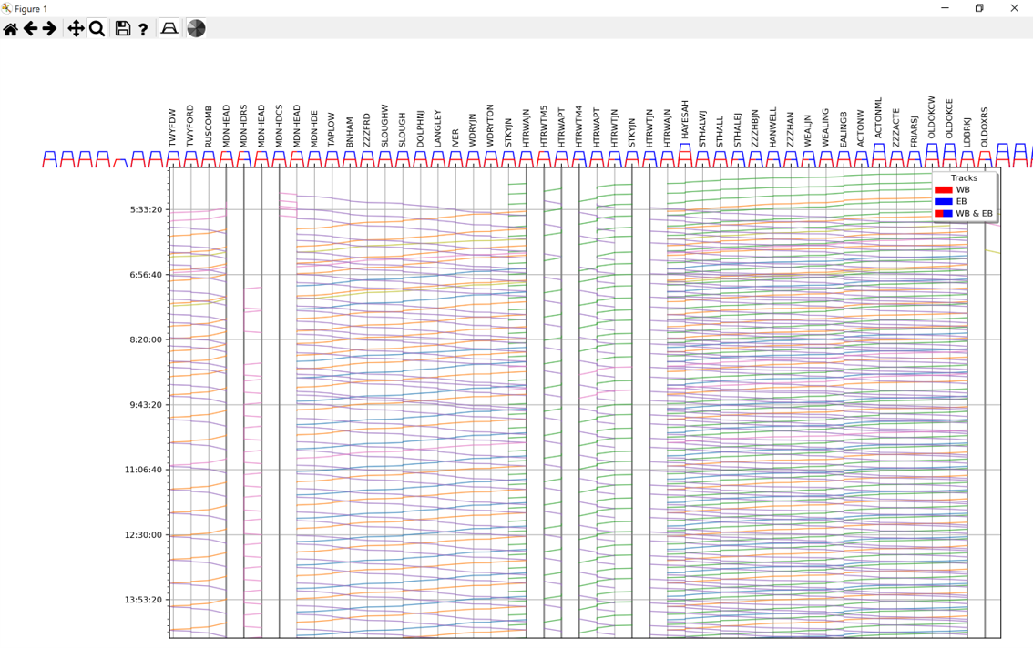
Static Time-Distance Graph
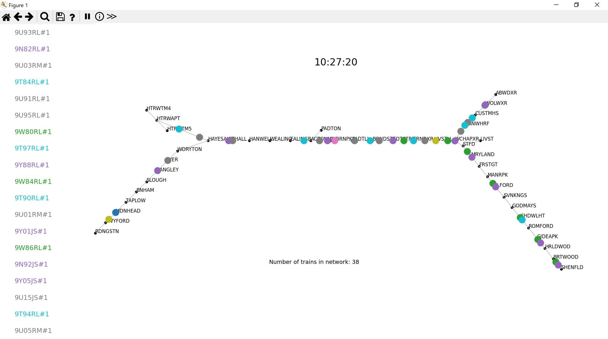
Network Graph
To maximize the usability, the two different graphs can be used as a dashboard. The user can select a train in the Time-Distance Graph and the corresponding train will be highlighted in the Network Graph. The user can also select a train in the Network Graph and the corresponding train will be highlighted in the Time-Distance Graph.
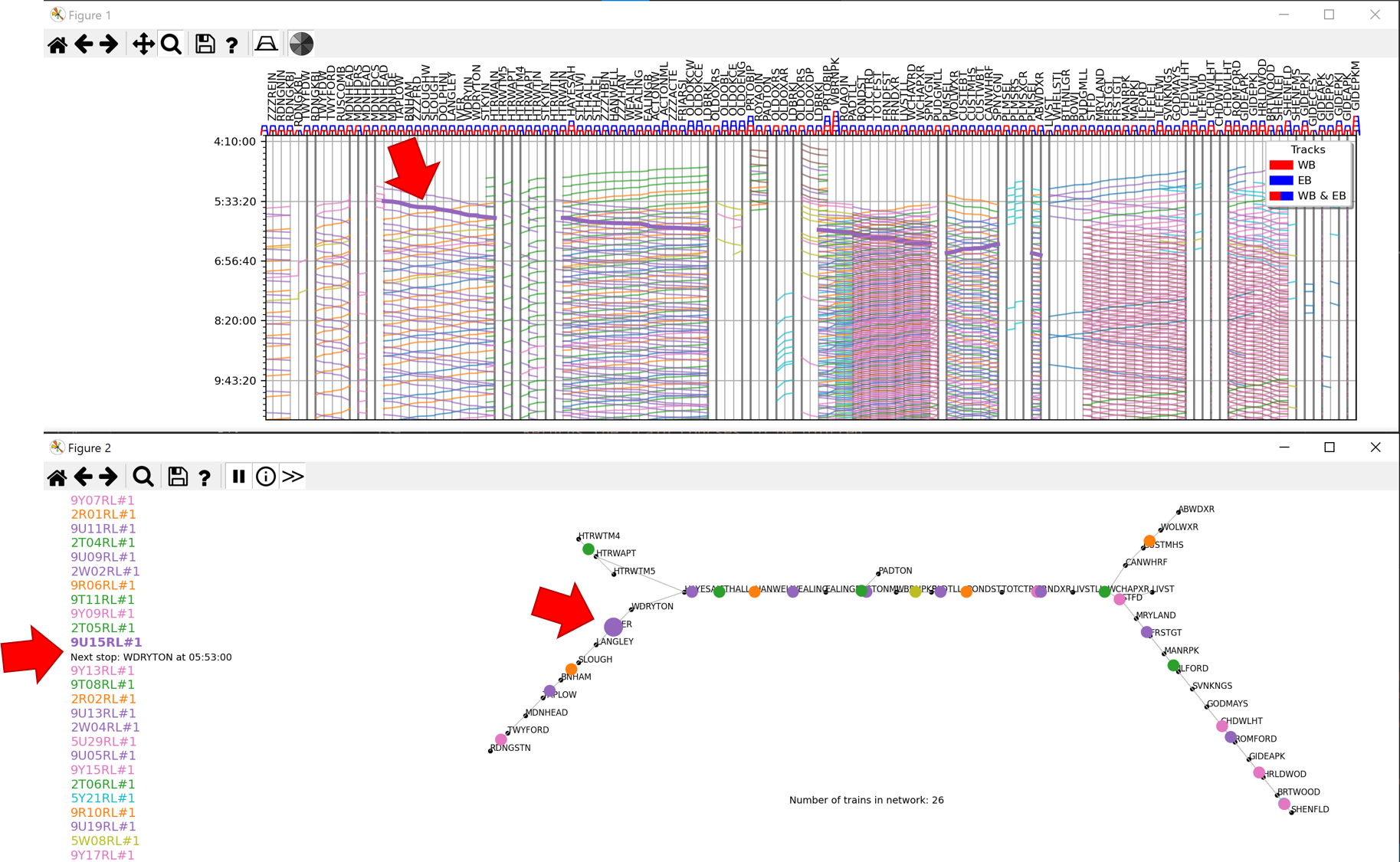
Dashboard of static Time-Distance Graph and Network Graph
In a second step, the dynamic visualization, conflict and conflict resolution information was added to the Time-Distance Graph using software provided by the institute for conflict analysis and resolution. If a conflict is identified, it is displayed in the Time-Distance Graph within a sliding window of a predefined timeframe, which runs in an animation from the departure time of the first train in the timetable to the arrival time of the last train.
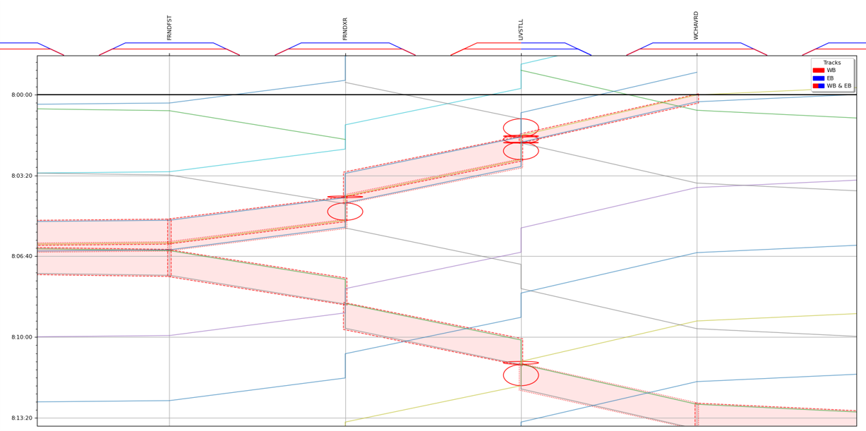
Dynamic Time-Distance Graph with conflicts
The red ovals in the above image indicate node conflicts while the red boxes indicate line conflicts including the trains captured in the box. The user can continue to the next timestep manually by clicking the "Next" button or automatically by clicking the "Play" button.
3. Quality Assurance
Quality assurance is vital for software development. Our team implemented continuous measures, such as code reviews and a CI pipeline, to ensure the code is maintainable, expandable, and functions correctly. We also conducted a user study to secure usability goals.
3.1. Maintainability
Maintainability describes to what extent the code can be adapted to changed requirements. This includes in particular the possibility of extending the code. The goal of the project is to visualize a train timetable in order to help develop good conflict resolution strategies and identify potential advantages and disadvantages of implemented strategies. It's important that the code is maintainable and extendable, as new aspects may need to be added in the future. The visual representation of the train schedule is an important tool for the institute as the results of the conflict algorithm and their implications are not easily understandable without visualization. The code should be able to function properly even if the algorithm, train network structure, data structure, or other requirements change in the future.
To esnure maintainability we carried out code reviews before merging any pull requests. We also used a linter to ensure that the code is consistent and readable. We also used a continuous integration tool to ensure that the code is always in a working state. The checklist used for code reviews includes criteria that aim for good code structure, readability, and high abstraction. These criteria are important for code extensibility, ease of changing existing code, and independence from specific file formats. In addition to code reviews we used different tools to ensure code quality. These tools include linters (PyLint, Flake8), a code formatter (Black) and a type checker (MyPy). Linters help identify logical errors, unused variables, and imports. Automated and standardized code formatting helps make the code more understandable. The Static Type Checker helps avoid errors in the usage of variables and functions.
3.2. Usability
Usability describes the ease of use of a software. The use of interactive graphics poses a challenge as it is not always clear which information will be of interest to users. To ensure efficient navigation and exploration of data, users should be able to easily identify and investigate irregularities and potentially receive additional information. The usability of the tool is crucial for effective use by experts to gain insights quickly and avoid missing important information due to poor usability.
To assure usability a qualitative usability study was conducted. Some participants had prior experience with similar systems and focused on different aspects than those without experience. The questionnaire for the usability study was based on a functional version of the two static graphs that were not yet interacting. Participants rated the usefulness and understanding of each feature, assessed the correct functionality of the implemented features and commented on the overall usability of the software.
3.3. Functionality
Functionality describes whether the implemented functions provide correct output. It is crucial for the institute to be able to use the software for their research. The software must correctly display the train schedule, the tracks, and the conflicts. The user should be able to interact with the software to change the schedule and the tracks.
To ensure functionality we used unit tests to verify the behavior and outputs of specific code sections against expected results for representative inputs. Additionally, the continuous integration and deployment pipeline ensured that all tests passed and the minimum statement coverage of 95% was met. The suitability of this measure was verified during the code reviews. The unit tests were written using the PyTest framework. The tests were run automatically after each commit and the results were displayed in the pull request. The tests were also run automatically before each deployment to ensure that the code is always in a working state. To test the corectness of the visualization we additionally performed manual tests.